MullenLowe Headoffice.
-
With each floor embracing its unique sense of style, Mullenlowe Sri Lanka head office located in Colombo consists, three floor levels of office spaces elegantly designed by a-designstudio in collaboration with Architect Nela De Zoysa Design. Fitout done by Westgate Interiors.
Mullenlowe, - “a creatively driven integrated marketing communications network with a strong entrepreneurial heritage and challenger mentality.” Whilst Mullenlowe Group head offices are situated in London United Kingdom and Boston United States the company has subsidiary branches globally.
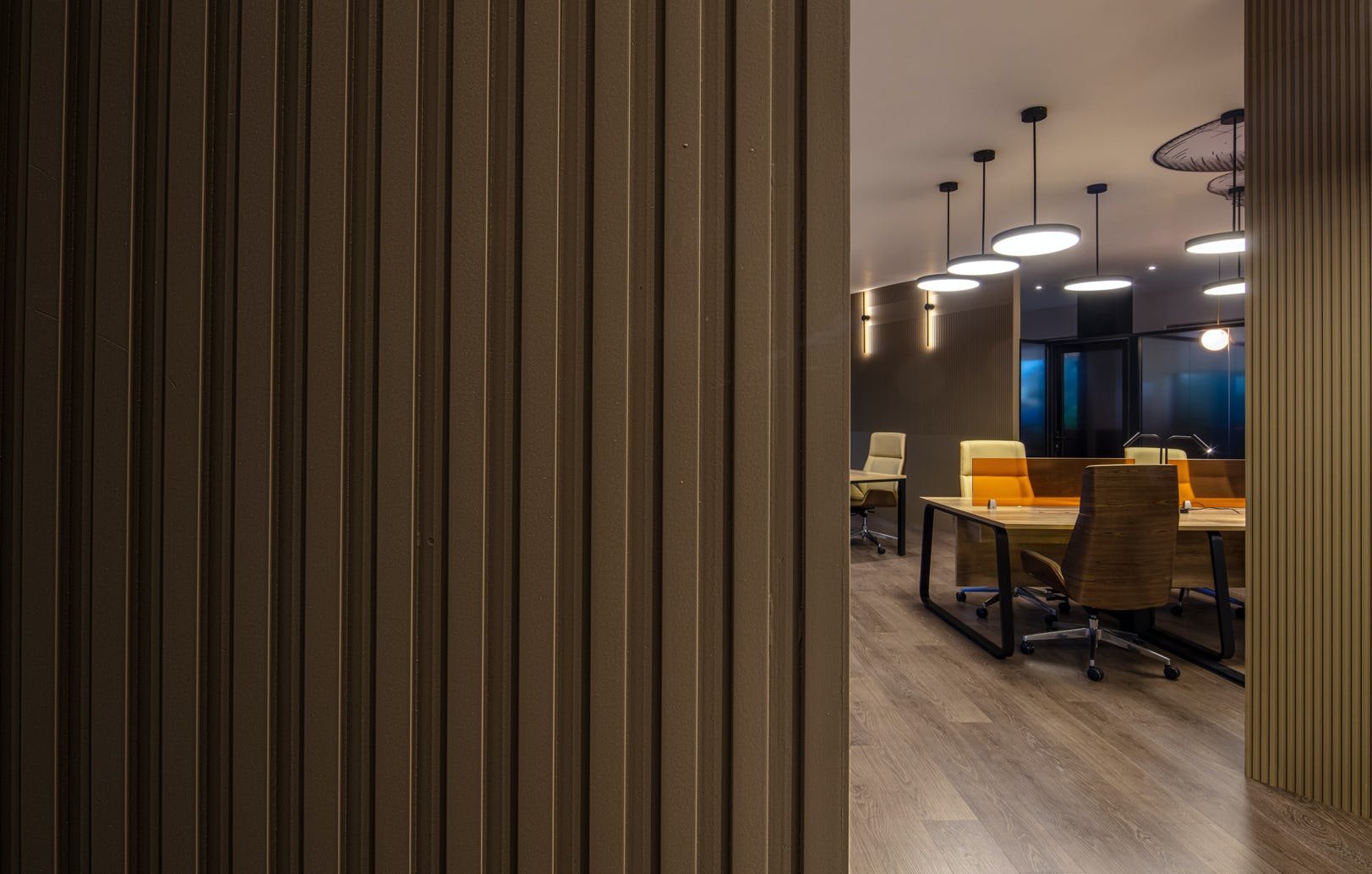
First floor level is fitted to create a modern sophisticated look and feel. The sleek combination of the brown/ beige tones with textured timber surfaces provides a warm working environment. The office rooms are treated with a dark gradient translucent finish to provide the occupants with the privacy they require yet keeping them connected with their co-workers at the open work stations. The combination of the carpeted and timber floors unconsciously segregates office rooms and the open work station areas. The cladded feature walls run a subtle groove detail to provide the vertical surfaces with grand height and depth. The loose furniture and feature lights too are of the same earth tones, maintaining the same minimal design aesthetic throughout the floor.
The second floor level is a unique take on vintage Art Deco design esthetic. The wall finishes blends in with the other design elements, providing a vintage look and feel. The decorative chandeliers and feature lights are a key design feature enhancing the Art Deco theme. The furniture although modern to suit an office space, are finished with light mauve and deep orange tones which adds a warm vibrant vibe to the interior. The mirror cladded columns exemplifies the Art Deco design style used throughout this floor.
The enjoyable play of vibrant colours are evident on this floor enhancing the whimsical nature of the design style. The playful design aesthetic is showcased with the bright teal walls, circular trellis feature lights, and the brightly coloured furniture. The white work stations are kept minimal in design thought out the floor, whilst balancing the play of colour. The open work station placed in the middle is treated with a lively art work which brings in a note of playfulness on the horizontal surface.
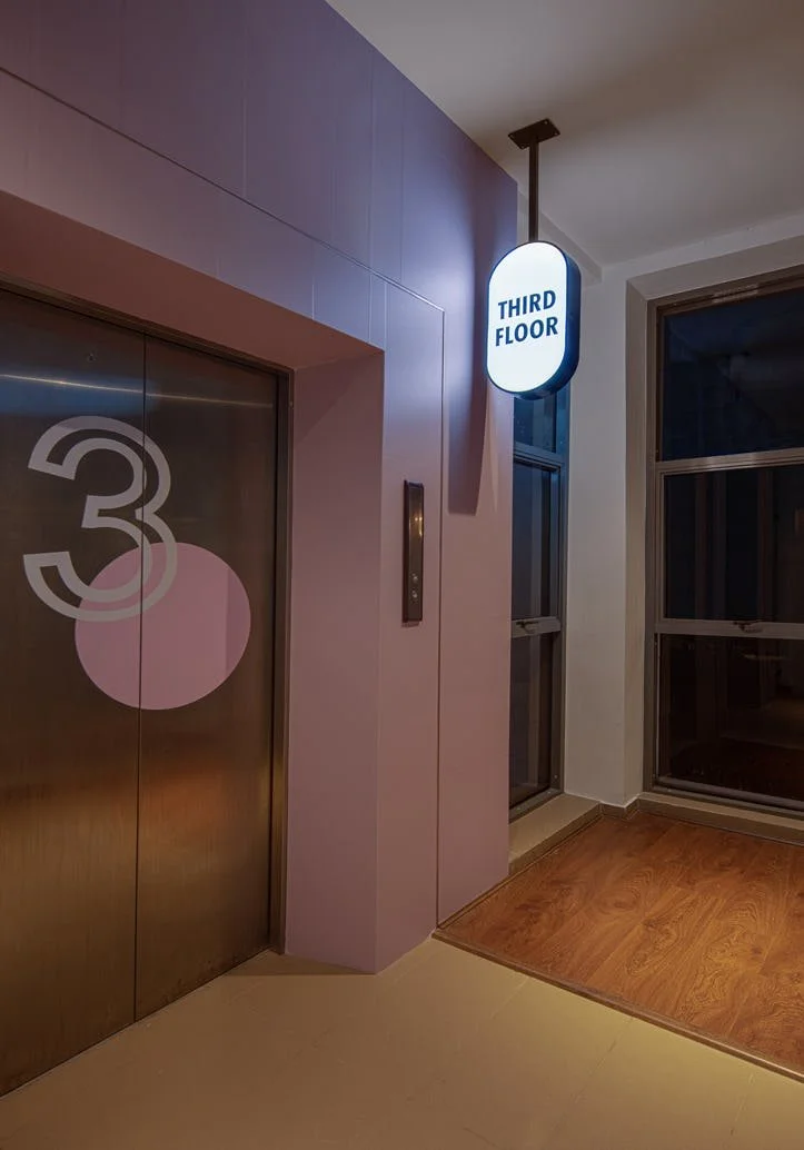
The lobby area of each floor is designed to fit its overall design theme providing a subtle design hint before entering the office space.
The “punchy” artwork used throughout each floor level is an interesting play of Mullenlowe’s octopus logo. Even though all floors of the office were designed to carry its own creative identity, elements of the logo have been used to amalgamate all office spaces providing one brand identity.
Creating work spaces for like minded individuals in the creative field certainly made the designing process enjoyable. The concepts of the interior for the offices were to capture the company’s bold and captivating creativity.


